Modest Modern Picks+Pics: Tropical Modernism

This week, two real-life people told me they actually READ my blogs – and in this day and age of the lazy #TLDR, I’ll take that as a success! So I’m back at it. I’ve been pretty quiet on social media this month because I’ve been distracted by the real world and the creative projects I’ve got in the works. One of those is the interior design for a new yoga studio here in Raleigh. We’ve settled on a style called ‘Tropical Modernism’. Think pastel colors like mint/pistachio or blush/rose + wicker and rattan accents + powder coated bent metal furniture + plants, preferably succulents, everywhere. The lines are still clean and minimal, the materials natural and organic, a feeling of the outdoors brought inside.  Check out the Tropical Modern look with my Modest Modern picks/pics this week. Happy Friday – and for my two readers (aka my two new BFFs), have an inspired weekend!

1  This is Cassina’s office headquarters in Italy – those mint Le Corbusier LC2 chairs and the slatted wood table, plus the green wall. Cassina creative director Patricia Urquiola nailed the tropical modern look. What can’t that woman do?!

Cassina.JPG

2  Eric Trine is on my hot list right now. His powder-coated bent metal furniture is so fresh and so clean clean and he knows just what colors are going to be trending – or more likely, he’s the trendsetter and we’re all just falling into his trap. A sage and pink and mint trap from which I never want to escape.

eric trine.JPG

3  Sarah Sherman Samuel designed lifestyle blogger DesignLoveFest’s space in LA and it’s perfect. Tropical Modernism is so very California – effortlessly laid back, relaxing but chic. You can almost feel the sand grains on the floor in this pic but you don’t care about dirt because you just came home from surfing even though it’s 11am on a Monday and you don’t have to work because money is so passe. You know, THAT look.

sarah sherman.JPG

4  I’ve fallen for Bend Goods for two reasons – their furniture and their marketing. You have to check out their website and hyper speed videos – they’ll have you hyper ventilating for more.

bend.JPG

5  This Eden Locke Hotel and Hyde & Son coffee shop designed by American firm Grzywinski + Pons has been the inspiration for our yoga studio design. And surprisingly, this tropical modern oasis is in rainy Edinburgh. My son and I visited it this summer and it’s even better in person. The Scots can finally feel like they’re in Sri Lanka 24/7 – but with their haggis in tact.

eden locke.JPG

Modest Modern Picks+Pics: Georgia O'Keeffe style

I just saw the Georgia O’Keeffe Living Modern exhibit and I fell in love with black and white all over again. She designed uniforms for herself, mainly in black and white, and mostly Japanese inspired. Even though O’Keeffe was born 129 years ago, she had a modern sensibility and aesthetic that still feels relevant today. I think you’ll see from my Modest Modern picks/pics this week that I’ve got Georgia on my mind. Happy Friday – have an inspired weekend!

1 Have you ever heard of the Japanese Mingei craft movement? Me either and now I’m kicking myself for missing out for so long on something I now adore so much. Mingei was the celebration of everyday objects made by unknown craftspeople in 1920s Japan. And The Apartment now has an installation of all things Mingei mixed with mid-century modern. Gulp.

Apartment DK japan.JPG

2 Ok and another Mingei image curated by Terry Ellis for The Apartment because I’m clearly in love and can’t see straight anymore.

Apartment DK japan 2.jpg

3 This Japanese inspired minimal art is perfect at the end of a hallway. It’s not quite Stop, it’s not quite Go – it’s Stay and look at me for a while.

japanese art etc for short.JPG

4 If you’re a woodblock print fan like me, you have to know about Block Shop. They do textiles and prints – and you can combine them like this pic for even more eye candy.

design milk block pillows and prints.JPG

5 Not Japanese and not black and white, but somehow I think New Mexico Georgia (not New York Georgia) would like this living room with its collections, natural  elements and minimalism. #georgiaokeeffeapproved

georgia inspired room.JPG

Modest Modern Picks+Pics: Fall Looks

Happy Monday! Since I’ve started seriously trying to be a designer (it’s still embarrassing for me to say out loud), a lot of you have asked me for ideas and tips. So I’ve had a little brainstorm over the weekend and am going to start sharing my favorite inspiring interiors with you on a more regular basis here. I’m calling it Modest Modern Picks+Pics – you like? Well, the weather finally feels like Fall here in Raleigh and that means I’m starting to nest even more than I usually do. And my eyes are feasting on the moodier colors and heavier textures – navy, rust, velvets. So sit back, have a scroll and get your picks+pics fix for the week.

1 This chair has my name written all over it. That leather with the deep sea armoire is a combination to repeat again and again.

lonny mag chair blue.JPG

2 One of my favorite designers is Sally Breer – you’ll see why if you check out her Etcforshort portfolio. This living room is at her Mom’s house. Genetics people.

sally breer.JPG

3 I have dreams of owning that rug on the back wall designed by Patricia Urquiola. It’s the best rug EVER designed in my opinion. I mean what rug have you ever met that could hang on a wall like ART?!

patricia urquiola rug.png

4 I get lost in your eyes marine blue console! Bludot is one of my go-to companies for minimal, quality, affordable pieces and they’re having their annual sale right now so get over there soon.

bludot.JPG

5 Rose, blush whatever you want to call it is so hot right now – and pair it with rust or navy and you’ve got me blushing all over. These velvet ottomans really soften up a minimal space.

sabaitalia ottomans.JPG

6 When I step out of the minimal realm it’s only for something as great as this teddy bear chair by designer Pierre Yovanovitch – after all, I am still a kid at heart!

teddy bear chairs.JPG

Less but better - the modern day 'tough love' mantra

You’ve heard the saying ‘Less is more’ repeated time and again but have you heard ‘Less but better’? Dieter Rams coined the concept of ‘less but better’ design, meaning as little design as possible in a product, eliminating the non-essentials. Back to purity, back to simplicity.

It’s hard to get back to simplicity, especially living in consumer-driven America. But once you’ve felt the power of walking into a big box store like Target and walking out with nothing, you’ll become addicted. I try to commit to not bringing anything into my house that I don’t really love. It’s not easy I’ll admit and often times I fail.

But sometimes I make great purchases that would make Dieter Rams happy. Like these Extos electrical cords from Conway Electric. I finally decided to replace my ugly cords with these and they make everything look better and more importantly they are USEFUL. The design is pure and simple, containing only the essentials to make electricity happen. The one extravagance? The yummy colors. Mint and Candy Pink.

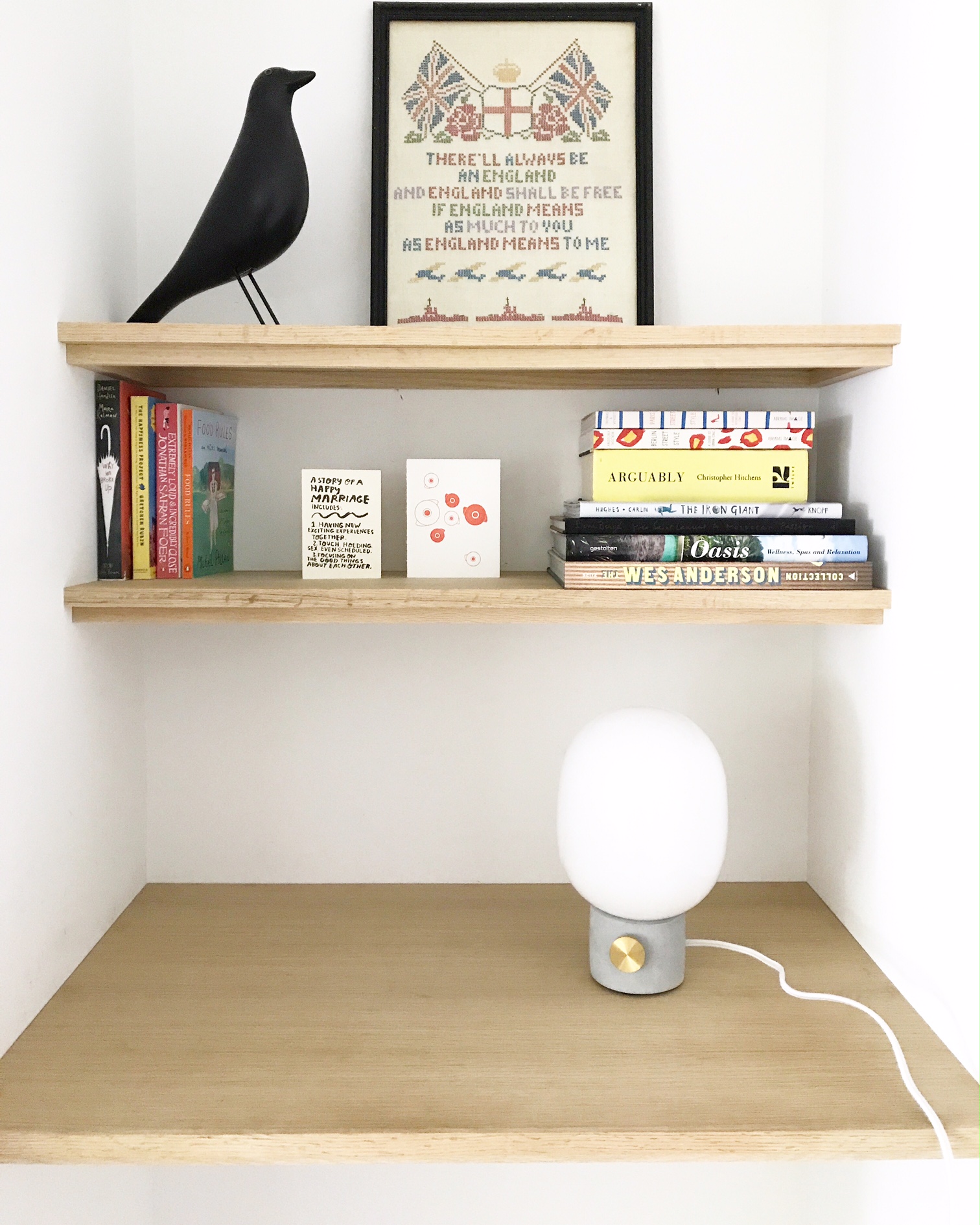
And this lamp from Menu. Glass, concrete and metal – all of my favorite materials. It’ll never go out of style and it’s distilled down to just the pure essentials.

Not every decision is as easy as those though. But being thoughtful about what we buy can feel so empowering. With every purchase I make, I spend time thinking about if it is worthy of bringing into my minimal modest home. Does it have a purpose? Does it have a story? If something doesn’t make the ‘less but better’ cut, then it doesn’t make it inside. #Toughlove

Thou shalt covet that other house

This summer our kitchen was featured in Dwell Magazine - the Your Rooms We Love edition. Dwell put a call out for photos from their readers' own homes and I answered that call by submitting some of our best photos. The 3 features that evoke the most envy from friends and visitors are our kitchen, the floating staircase and my bathtub. Dwell chose to feature a two-page spread of our kitchen. It was completely flattering and a bit embarrassing to see it in print, next to some other more lust-worthy homes and rooms than ours. 

And that was the moment that I realized I would always be afflicted with house envy. It was a disease I thought (and my husband hoped) would be cured once we built this house but seeing our house on those pages next to the others, I realized that I loved everyone else's rooms more than my own. That the stuff they chose to fill their spaces with was much more interesting and artistic than my stuff. 

If you've ever read and immediately related to the the New York Times series, Coveting Thy Friend's House, you know exactly what I mean. The other houses and spaces that we covet are   true expressions of ourselves, of who we would be and how we would live if we weren't constrained by those little annoyances of money and time. And while coveting can sometimes tear apart your soul (oh the drama!), what if instead we looked at it as motivation and inspiration? I don't really want to ever be done designing or decorating my home or even my next home and so that 'other house' that is so much better than mine pushes me to continually reinvent my space.

So whether it's an affliction or inspiration - in my books, house envy is what got me out of a dark choppy bungalow and into this bright open modern house that has changed the way my family and I live. Long live coveting!

To IKEA or not to IKEA...

Big news! We heard from DWELL Magazine this week that we're going to be in their upcoming Reader's Issue! They're featuring a photo of our kitchen with Noah and Chloe in it. It shows our floor to ceiling wall of IKEA cabinets with a custom wraparound stainless steel frame in the center. I'd been carrying around this vision of my future kitchen in my head for over 3 years, and when it came time to actually making it a reality, it was shocking how much cabinetry it was actually going to take...45 cabinets just for the one wall! With that in mind, we couldn't afford custom cabinets so I set out to find an affordable option and IKEA was pretty much it. I'd never had much luck with their furniture just in terms of longevity, so I read a lot of online reviews and talked with our architects who had installed some in another house they designed. It seemed that IKEA had recently improved the quality and durability of their Akurum cabinets - the drawer is made of solid metal so it won't swell and warp, they use quality hardware, Blum hinges and drawer dampers for soft closing, and it's completely modular so you can adapt them to an amazing degree. We went for it! Here's my general view on whether or not to use IKEA built-ins in your home:

  • Use it sparingly. Don't use it everywhere in your house (and that applies to IKEA furniture too) but be sure to mix it with some other interesting material or pieces that have a good story or feel custom and unique. 
  • Use it in a creative way - cut it, paint it, build on to it - there are tons of IKEA Hack sites out there now for ideas but here are some of the most elegant of them.

The IKEA kitchen cabinet is a cult phenomenon that has really taken over in the modern home design field. For creative people who can think outside of the box (or cabinet), it's a good-looking affordable solution.